
The Masthead of the front cover is large, red and is positioned to the right hand side of the page. It is unusual for a title to be positioned here, which draws the audience’s attention. The colour red also attract people. The central image shows a young girl at a festival having fun. This is an image that attracts young people because it looks fun and playful. The cover lines are positioned at the bottom of the page and are small apart from the larger titles, which advertise the magazines contents. The puff is in a red bubble to draw the eye and offer something that people may be interested in.
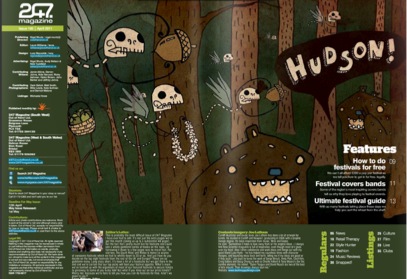
The central image takes up most of the space on the contents page. The colours are green and brown and the image is unusual, this makes the audience want to read on and relate to teenagers as they usually feel they need to be individual. The contents of the page are positioned around the image in different sections to break it up. There are different colours to highlight the key information. The fonts range and some are larger or positioned differently, this makes the text more eye catching and connotes a sense of fun and liveliness; which is what the target audience is interested in.
No comments:
Post a Comment